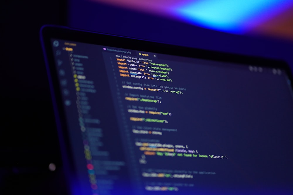
Icons and screenshots are the first things the user deals with in the mobile application store. However, it does not mean that other components of the application promotion are not important, because everything in complex creates a general impression of your project. Optimizing the block from the screenshots is most effective in terms of increasing conversions in installation.
On the screenshot, the user sees the application screen with the frame of the device and text annotation.
The maximum number of screenshots in the App Store is 5. The first two images are the most important because they will be shown after loading the application page.
The maximum number of screenshots in Google Play is 8. If you have enough information, and the application’s interface is diverse, you should use the full limit. To demonstrate all the benefits of your mobile application, you should try to present it in 4-5 screenshots. It is necessary to determine the benefits, formulate the parameters that are important to your target audience. Next, choose the best part of the application interface that demonstrates them. After defining screenshots, you need to make a set of these images for diverse sizes of screens.
At this stage, it is very important to attract the user. The potential customer sees the first two screenshots, which should be something unusual, and only after that, one makes a decision to continue watching other photos. It is required for the user to view all screenshots of your mobile application. Images must correlate with the person’s imagination. As usual, the majority of people make a decision in 3 seconds.
The screenshot should show what the user will have by downloading the app. If the image from the screenshot will be present only in the application store, but the app itself will be quite different, a person will be disappointed. No need to try to hide the project behind a graphic design. The main thing is to show everything you have from a winning point of view but without exaggeration.
To create high-quality screenshots of your mobile application, there are free services that will generate it according to your requirements. In addition to screenshots, you can also use videos. You can use 15 to 30 seconds of video for the App Store. In Google Play, from 30 seconds to 2 minutes of video is allowed. However, only the first 5 seconds are important because not all users are ready to watch it to the end.
For screenshots, it is essential to meet the requirements of the target audience as well as locality. Each country has its own associative forms, colors, etc. For example, in Hollywood, the color palette of blue and yellow shades is very popular in perception. If you apply these shades, users in the western part of the US will trust your product more.
The impact of the screenshot on the overall impression and rating should always be monitored. This way, you will be able to analyze different options to understand the needs of the market and individual user segments. The services that will help you to achieve your goal are provided by ASO companies.
If you want to do it by yourself, you can find useful recommendations at https://agilie.com/en/blog/how-to-improve-your-app-store-screenshots-10-ways.
The screenshot is the first impression of your brand; it is the visual positioning of your application. The interface is not visible through the icon, but screenshots help users make a final decision. Even negative reviews will not affect the number of downloads if the screenshot motivates users to see the application themselves.
However, if the screenshot does not satisfy the user, the reputation will be negatively affected. Even great applications might fail if their screenshots are poorly created.


